SciQt provides various mechanism to allow you to interact with the main window chart area. These interactions can be:
Global - The interaction effects the whole chart area (eg global zooming)
Chart level - The interaction effects an individual chart (eg change title of chart)
Data object level - The interaction effect an individual data curve on the chart (eg set up plot rule)
Some of these interactions can be achieved directly on the chart area whereas other interactions require you to first pop up a dialog.
Direct interactions with the chart area allow you to interact with the chart without popping up additional dialogs
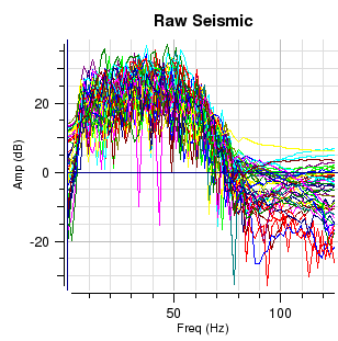
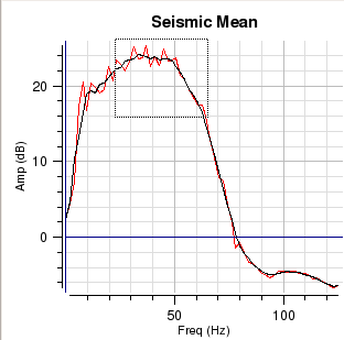
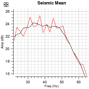
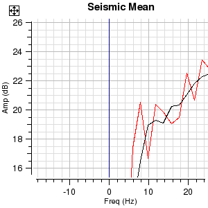
Global zooming allows you to zoom the chart area in or out with the mouse.
 .....
.....
The images in the figure above show how the central chart area can be zoomed in and zoomed out in a global sense.
Zooming in is achieved by either clicking on the menu item View->Zoom In or clicking the  icon. The LH image shows the result on the charts of zooming in.
Zooming out is achieved by either clicking on the menu item View->Zoom Out or clicking the  icon. The RH image shows the result on the charts of zooming out.
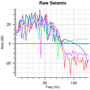
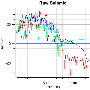
Frequently on charts there can be several curves plotted. Therefore identifying a particular curve amongst the jumble may appear to be a daunting task. However, a facility has been provided which allows you to point at a Vertex and clicking with mouse button 1 (MB1) will display the name of the curve in the status bar.
 .....
.....
The images in the figure above show how data on an individual chart can be identified.
To identify data on a given chart point to a vertex on one of the data curves and press MB1 (you need to be near to a vertex). If you are close to a vertex when you click MB1, the curve name and the coordinates of the vertex will be displayed. This is useful since it gives you a mechanism for identifying anomalous curves so that they can be removed. In the LH image there is a spike on the red curve around 43Hz. Clicking on the tip of the spike identifies it as TRACE_005. Now, in this case, you can go to the "Input Seismic" tab on the "Select Input Data Dialog" and deselect it. The RH image shows the result of deselecting TRACE_005.
Data zooming is different from global zooming as data zooming is only performed on an individual chart. Like global zooming it is quick and easy. Charts zoomed in this way stay zoomed until you revert them to an unzoomed state. You can zoom in and out on individual charts by pressing and holding the Control key then rotate the mouse wheel either towards you (zoom out) or away from you (zoom in). The zooming will be centred around the position of the mouse. Alternative methods for individual chart zooming are described below.
 .....
.....
The images in the figure above show how data on an individual chart can be zoomed. Data zooming is the process of identifying a data area within a given chart and arranging the chart axis so that area fills the chart.
Data zooming is achieved by dragging a rectangular box (rubber band) over an area of the data on one of the charts that is to be zoomed. You invoke data zooming mode by pointing to the chart that is to be zoomed and pressing MB3. This pops up a menu. Select "Zoom Data (Shift MB1)" will put you in data zooming mode. Now pressing and holding MB1 and dragging will allow you to rubber band the area on the chart that is to be data zoomed. Letting go the MB1 will instantly data zoom the chart. After data zooming the MB1 will revert to its default mode "Identify Data". To unzoom the data press MB3 to pop up menu and select "Unzoom/Recentre Data (Shift MB1). Another faster method of achieving the same result is to press and hold the Shift key whilst sweeping out a rectangle by pressing and holding MB1 and dragging over the area that is to be data zoomed. To unzoom simply hold down Shift key and press and release MB1 on the chart. If you have zoomed in multiple times, this action will unzoom in steps. Pressing MB2 on the chart will also unzoom in steps. Note the ![]() icon which unzooms all and recentres the data in one go. This can also be achieved by MB3 clicking and selecting the "Unzoom All/Recentre Data" pull down menu item.
icon which unzooms all and recentres the data in one go. This can also be achieved by MB3 clicking and selecting the "Unzoom All/Recentre Data" pull down menu item.
The LH image shows the rubber band box identifying the area that is to be zoomed and the RH image shows the result of the data zoom.
Moving data is a mechanism which allows you to grab hold of the data on a chart and drag it to a new position. Essentially you are changing the axes on the chart coordinate system.
The images in the figure above show how data on an individual chart can be moved.
Moving data is achieved by pointing to a position on a chart and moving that position to a new place. You invoke move data mode by pointing to the chart where you have data that is to be moved and click MB3. This pops up a menu. Select "Move Data (Ctrl MB1)" which will put you into move data mode. The next time you click and hold with MB1 on the chart the position to be moved will be identified. Whilst holding down MB1 move to the new position. Data will move interactively as you move to the new position. Letting go the MB1 will leave the data at the new position. After data moving the MB1 will revert to its default mode "Identify Data". To re-centre the data press MB3 which will pop up a menu then select "Unzoom/Recentre Data (Shift MB1). A faster method of achieving the same result is to press and hold Ctrl key then press and hold MB1 whilst dragging the data to the new position.
The LH image shows the old position of the data with the RH image showing the new position of the data.
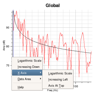
It is sometimes useful to see axes displayed differently. This is easily achieved via a pop up menu. Clicking MB3 on a chart will cause the pop up menu to be displayed. The menu will show, amongst other options, a cascade menu for X Axis and Y Axis.
The cascade menu for the X Axis allows you to toggle between:
Linear Scale or Logarithmic Scale
Increasing Right or Increasing Left
Axis at Bottom or Axis at Top
The cascade menu for the Y Axis allows you to toggle between:
Linear Scale or Logarithmic Scale
Increasing Up or Increasing Down
 .....
.....
The images in the figure above show how an axis can easily be changed from a linear to a logarithmic scale.
By pressing and holding MB3 whilst hovering over the y axis or x axis or the data area of the chart, you can pop up a menu. In this case the user clicked over the y axis. Moving to the X Axis item on the pop up menu will cause the X Axis cascade menu to be displayed (LH image). Then, moving to the right over the cascade menu item and releasing MB3 will cause the chart to be redrawn with a logarithmic X axis (RH image).
Other changes to the X and Y axes or chart data can be performed in a similar manner.
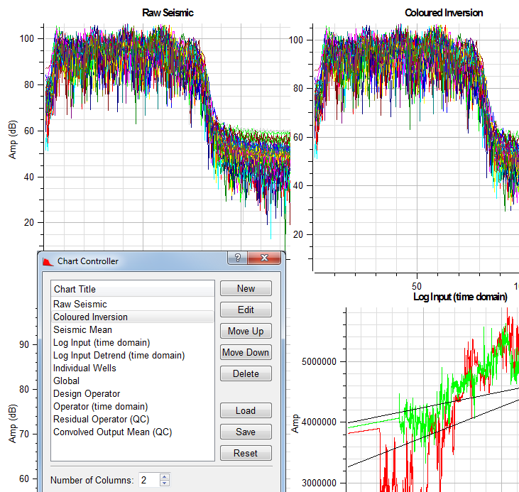
The Chart Controller dialog allows you to change various properties of a chart. The Chart Controller will also allow you to create new charts, delete charts, edit charts, control layout (number of columns) and change the order of the charts within the chart area. A useful feature is that the current chart configuration can be saved to a XML file. Subsequently the XML file containing the chart configuration can be loaded to the current session. Chart configuration XML files do not save data or SciQt parameters so can be readily used in other projects or sessions. The Chart Controller dialog can be popped up by clicking menu item or clicking the  icon. The figure below shows the Chart Controller. Changes made via the Chart Controller are immediately updated on the Chart Area of the Main Window.
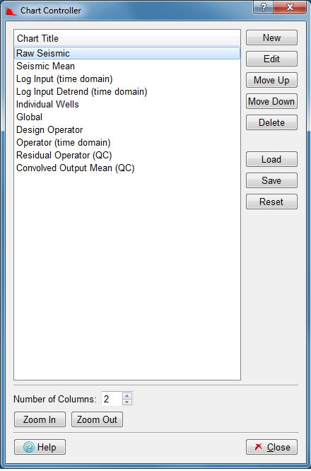
The sub-sections below outline the various tasks that can be performed from within the Chart Controller.
Creating a new empty chart is a very simple process. The table below shows an example of how this is achieved.
 .....
.....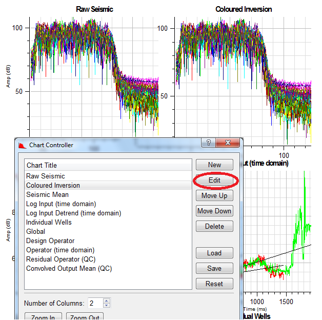
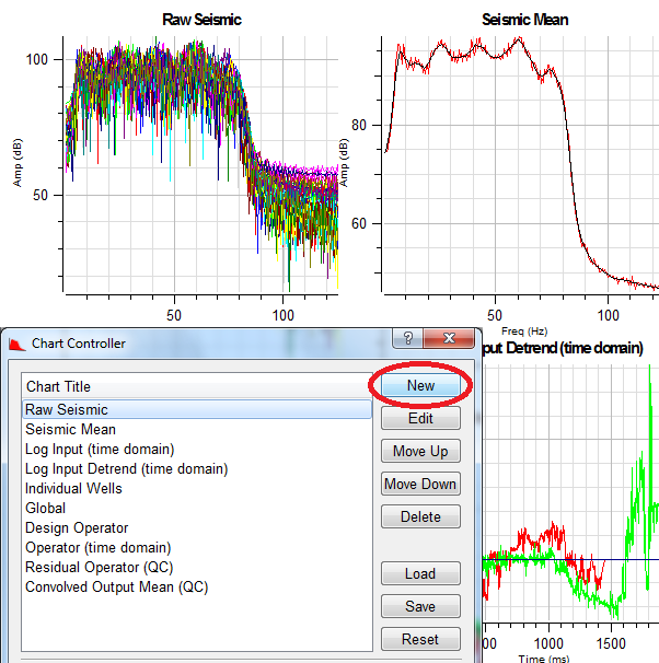
The two images in the figure above show how a new chart can be created.
With the Chart Controller dialog displayed, select an existing chart from the list of available charts. The selected chart will be highlighted (reverse video). Now, click the push button (first image) which will cause a new empty chart to be inserted immediately below your currently selected chart (ie below the "Raw Seismic" chart in this case). Note in the chart area of the main window, charts are arranged in rows. So, in a two column arrangement the first chart will appear in row 1 column 1, the second chart appearing in row 1 column 2 and third chart in row 2 column 1 and so on. In the Chart Title list the new chart named "New Chart", will become the currently selected chart and will be highlighted. The main window will also be updated to show the new empty chart.
To change the name of the new chart, simply click on "New Chart" and type the new name you require directly within the Chart Controller dialog. Here we have changed the name from "New Chart" to "Coloured Inversion". The Main Window will be updated as soon as you press "Return" or "Enter" or by clicking away from the just edited chart name in the list. You can change the name, at any time, of any of the charts in the list. With the new chart created it is normal to label the axis and to select the Data Items to be displayed in the chart. You can achieved this by clicking the push button to pop up the "Display Options" dialog. In this case the user has labeled the X axis as "Freq (Hz)" (not visible) and Y axis as "Amp (dB)". The user has also selected the "Convolved Trace Spectra" group for the Data Item to be displayed in this chart.
The first images show Main Window before the new chart is added with the second image showing the Main Window after the new chart has been added and renamed.
Moving charts is very simple. The table below shows an example of moving a chart within the chart area.
 .....
.....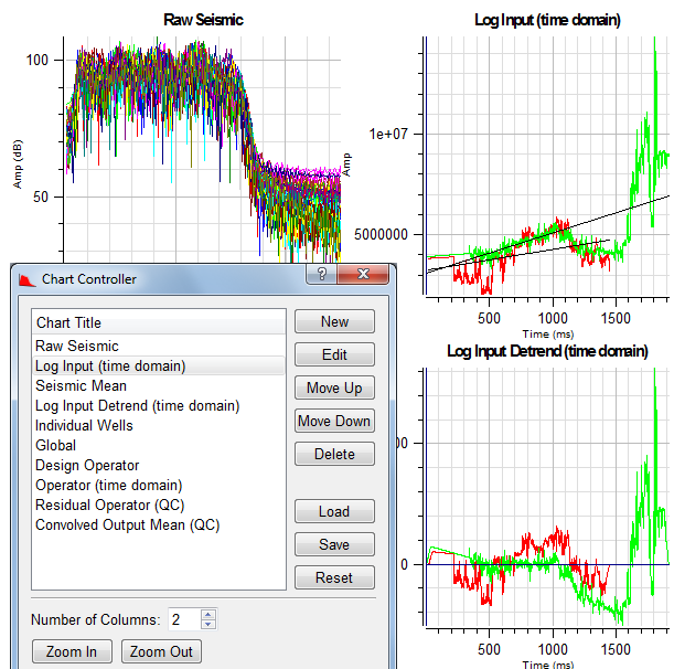
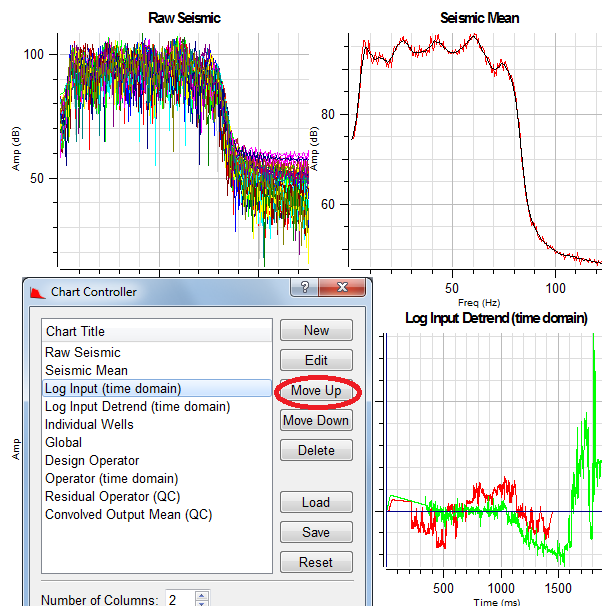
The images in the figure above show how a chart can be moved.
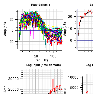
The first image shows the "Log Input (time domain)" chart selected. The SciQt Main Window shows the "Log Input (time domain)" chart in the bottom right corner of the display. Clicking the push button twice causes the chart to move up two positions in the Chart Controller dialog list. The Main Window is immediately updated with each click. The second image shows the "Log Input (time domain)" chart in its new position top right corner of the display.
The push button moves the chart in the opposite direction.
Like the other tasks described above, deleting charts is easy.
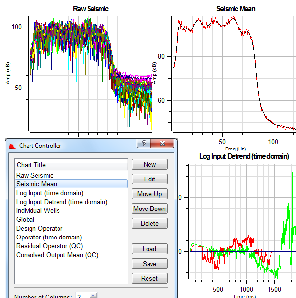
The images in the figure above show how a chart can be deleted.
Just select the chart from the list and click the push button. The chart is deleted immediately without any warning, so you are advised to be careful when using this option. The SciQt Main Window will update immediately to show the chart area with the deleted chart removed.
The LH image shows the "Log Input (time domain)" chart before clicking the push button with the RH image showing the chart area with the "Log Input (time domain)" chart removed. Note, the charts below the deleted chart move up one position.
Saving and loading the chart configuration is a powerful facility which allows you to view your session in many different ways. Chart configurations are saved in XML files. Only information about the charts are saved in such files. This facility also allows you to use chart configurations saved from previous sessions in other projects. Note, application parameters and information to reload data are not saved. The save sessions facility is designed for this purpose.
 .....
.....
The images in the figure above show how you can load a chart configuration.
The first image shows a chart configuration with ten charts. In this example the user has clicked the push button which pops up a file selector dialog. Here an alternative chart configuration XML file was selected which changes the chart area by adding another chart named "Coloured Inversion". The second image shows the chart area has been updated with another chart which, in this case, was used to display Coloured Inversion spectra. At any time you can use the "Chart Controller" dialog to save a specific chart configuration to an XML file for future use in this or other projects.
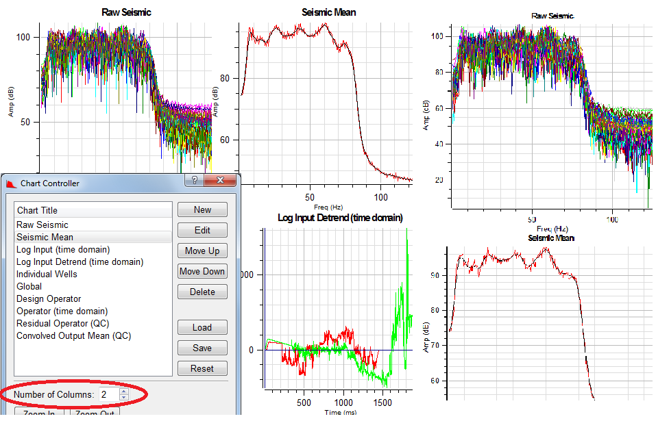
The chart area is divided into columns. The number of columns parameter allows you to control the number of charts that can be displayed in a chart row. This can range from 1 up to 30. The table below gives you an example of how this parameter is used.
The images in the figure above show how the various charts can be laid out within the central chart area of the main window. The parameter which controls the number of columns can be found in the Chart Controller dialog. This dialog can be popped up by either clicking on the menu item or clicking the icon.
The Chart Controller dialog above shows the Number of Columns parameter set to 2 which would cause the central chart area of the SciQt main window to appear like the chart area on the left (ie two columns of charts). The RH image shows the central chart area with one column of charts (ie the Number of Columns parameter set to 1).
The and push buttons perform the same functions as those described in the section entitled Global Zooming
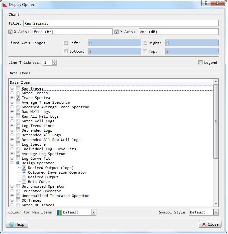
The Display Options dialog allows you to control what data is displayed in a given chart. The Display Options dialog will also allow you to change some chart properties including: Title (can also do this on the Chart Controller), the labels on the X Axis and Y Axis and Line Thickness. Currently, Line Thickness parameter controls the thickness of every data item on the chart. It is not possible to change the Line Thickness of an individual data item. The Display Options dialog can be popped up by clicking the Edit push button on the Chart Controller dialog or by MB3 on the chart and selecting from the pop up menu
The sub-sections below describe the various tasks that can be performed from within the Display Options dialog.
Changing chart titles, axes names and line thickness via the Display Data Items dialog is very simple.
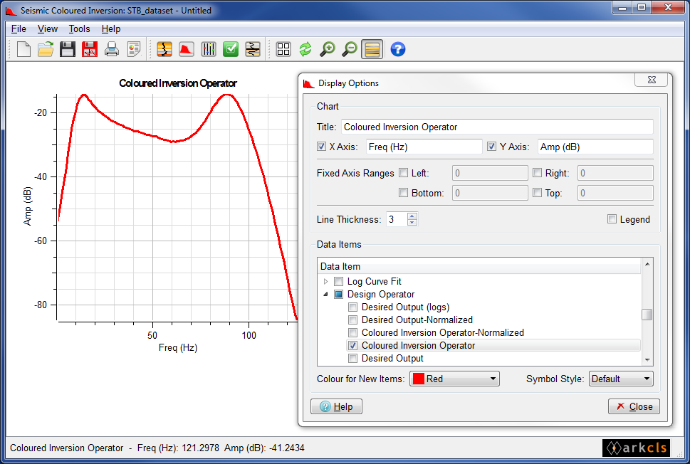
The figure above shows how you can change title, x axis label, y axis label and line thickness.
In this example we have changed the title, the x axis label and y axis label together with the line thickness of data items displayed on this chart. As we edit these fields the SciQt main window is updated in real time.
This is a very powerful feature which allows you to specify what data is to be displayed on a given chart.
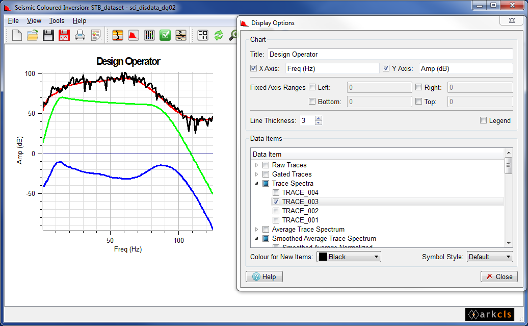
The figure above shows how you add and remove data items to a chart. Data items are assigned data label names and are grouped together into logical sets. The set (or group) name, together with the data label name, uniquely identifies the data item. So, for example, in the "Trace Spectra" group the trace spectra data items are given names of the form "TRACE_<counter>" where counter is in the range "001" to "999". So, the first trace spectrum would be assigned a label "TRACE_001" with the second trace spectrum assigned "TRACE_002" and so on. Similar names are assigned to "Raw Trace" and "Gated Trace" groups.
Now data items can be added to a chart by selecting the group name and the data label name within. The image above shows the "Display Data Items" dialog with the "Data Item" list displaying the "group names" and optionally the "data label name" if the group is open (ie expanded). Groups can be expanded or collapsed by clicking to the left of the group name. So, once a data item is selected for a chart, whenever that data item is available it will be displayed on that chart.
In the image above where we have selected the data item labelled "TRACE_003 within the "Trace Spectra" group. Notice that displayed the "TRACE_003" spectrum is now displayed (black line on the "Coloured Inversion operator" chart). If we now clear the traces via the "Select Input Data Dialog" and reload more seismic traces we will get a new trace labelled "TRACE_003" displayed on the "Coloured Inversion Operator" chart. This persistence is a useful feature of the underlying, rule based, chart control system.
At the time you select a data item for display you can assign a colour. Alternatively, you can allow a colour to be assigned automatically.